Data visualization tools are essential in today’s data-driven world, helping individuals and organizations make sense of complex information through visual representations. These tools enable users to explore data, identify patterns, and communicate insights effectively. In this article, we will delve into the world of data visualization tools, exploring their significance, types, and popular examples.
One of the key advantages of using data visualization tools is their ability to simplify complex data sets, making information more accessible and understandable. By transforming raw data into visual formats such as charts, graphs, and maps, these tools enable users to quickly grasp trends and correlations that may not be apparent in tabular form.
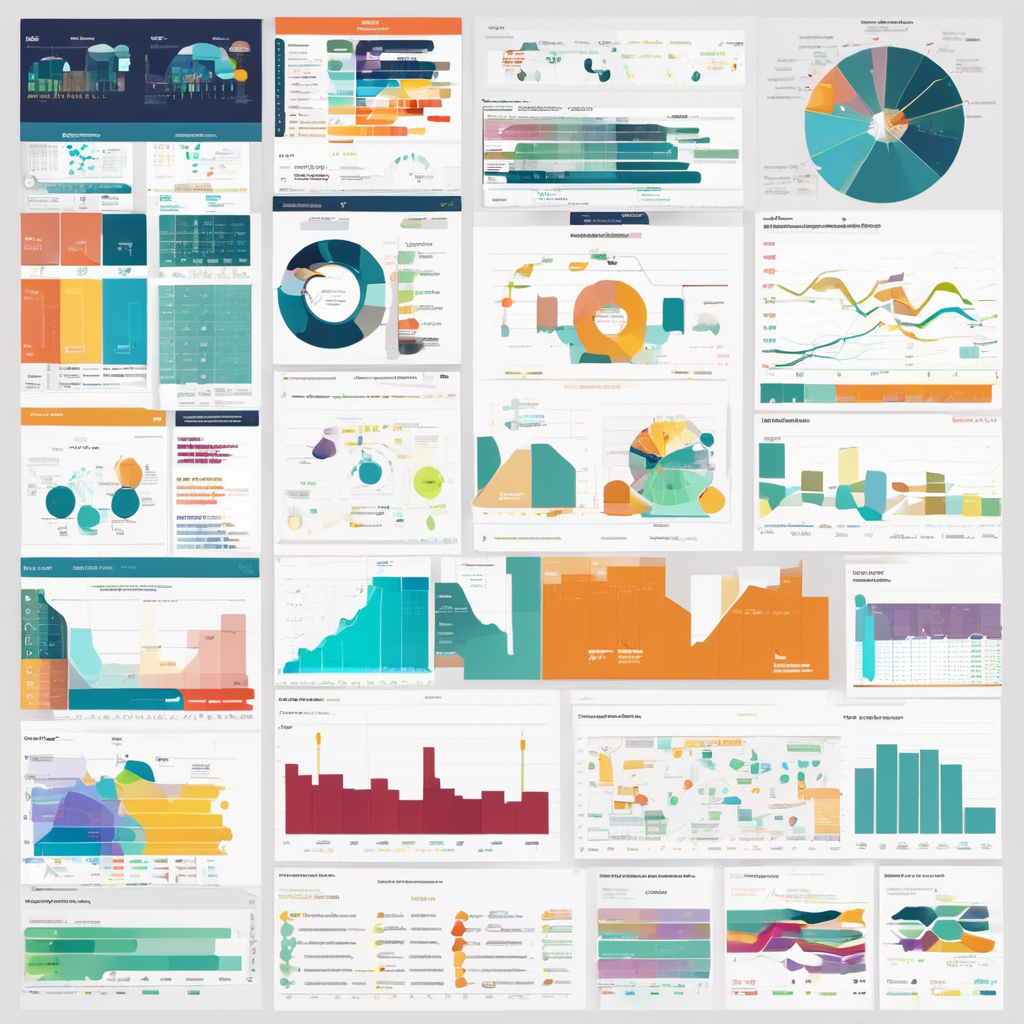
There are various types of data visualization tools available, each catering to different needs and preferences. Some tools focus on basic charting and graphing functions, while others offer advanced features such as interactive dashboards, real-time updates, and predictive analytics capabilities. The choice of tool often depends on the specific requirements of the user and the complexity of the data being analyzed.
Popular data visualization tools include Tableau, Microsoft Power BI, Google Data Studio, and D3.js. Tableau is known for its user-friendly interface and powerful visualization capabilities, making it a favorite among beginners and experienced analysts alike. Microsoft Power BI, on the other hand, offers seamless integration with Microsoft products and advanced data modeling features.
Google Data Studio is a free tool that allows users to create interactive dashboards using data from various sources such as Google Analytics, Google Sheets, and BigQuery. Its drag-and-drop interface makes it easy to design visually appealing reports and share them with others. D3.js, a JavaScript library, is widely used for creating custom and interactive data visualizations on the web.
In addition to standalone data visualization tools, many business intelligence platforms also include built-in visualization capabilities. These platforms offer a one-stop solution for data analysis, visualization, and reporting, catering to the needs of organizations seeking comprehensive business intelligence solutions.
The significance of data visualization tools extends beyond the realm of business and analytics. In fields such as healthcare, education, and journalism, these tools are used to present complex information in a clear and engaging manner, aiding decision-making and knowledge dissemination.
Data visualization tools have also played a crucial role in the field of data journalism, enabling reporters to convey stories and insights through interactive graphics, maps, and visualizations. By harnessing the power of data visualization, journalists can present information in a compelling and informative way, engaging readers and enhancing their understanding of complex issues.
As the volume and complexity of data continue to grow, the demand for effective data visualization tools is expected to increase. Whether you are a data analyst, business professional, researcher, or student, mastering data visualization tools can enhance your ability to extract meaningful insights from data and communicate them with clarity.
In conclusion, data visualization tools are indispensable in today’s data-driven world, empowering individuals and organizations to unlock the value of data and derive actionable insights. By leveraging the capabilities of these tools, users can transform raw data into compelling visual narratives that drive informed decision-making and foster a deeper understanding of the world around us.